
Healthcare workflow mapping is a visual, evidence based way to make work visible so teams agree on reality, spot bottlenecks and prioritise improvements. It documents what actually happens, not what the policy folder claims happens. The immediate next step is simple: pick one narrow, painful process and run a 60 to 90 minute mapping session with the people who do it.
TL;DR:
- Mapping only the operational process at the L3 level provides the most useful detail for improvement teams without wasting time on unnecessary documentation.
- Shadow processes and informal workarounds often reveal the greatest risks and should be captured on maps to ensure accurate reflection of real work.
- Digital tools should be used mainly for final validation and storage of maps, while physical sticky notes remain best for interactive, real-time workshops.
- Regular review and assigning ownership are critical for keeping workflows accurate and ensuring continuous improvement over time.
- Integrating mapped workflows with electronic health records and governance platforms enables real-time compliance tracking and audit-ready documentation.
Table of Contents
- What is healthcare workflow mapping and why does it matter?
- Types of maps and the L1 to L4 hierarchy: choosing the right altitude
- How do you run a healthcare workflow mapping workshop?
- What tools and templates work best for mapping?
- How do you turn a workflow map into real improvement?
- How does Keystoneconsulting turn mapping into governance?
- How long does workflow mapping actually take?
- How do you capture unwritten knowledge during a mapping session?
- How do mapped workflows connect to your EHR and IT systems?
- Can one workflow map fit every clinical specialty?
- How do you train staff to read and use workflow maps?
- Practitioner perspective: what actually goes wrong with mapping
- Ready to move from mapped workflows to audit-ready governance?
- Sources
- FAQ
What is healthcare workflow mapping and why does it matter?
Most healthcare organisations run on two versions of every process: the one written in the policy document and the one staff actually perform under pressure, short-staffed, at 3am, with a printer that jams. Workflow mapping closes that gap by documenting the real sequence of steps, decisions and handoffs, rather than the theoretical protocol someone wrote three years ago. The AHRQ's workflow mapping guidance is built on exactly this principle: a map only has value if it reflects actual practice.
That mismatch between perceived and actual process is not a minor inconvenience. When a discharge coordinator believes a step takes ten minutes and it actually takes forty because of a system that logs them out every five, every staffing model built on the ten-minute assumption is wrong. A systematic review of process mapping in healthcare found that mapping builds shared understanding among team members precisely because it surfaces these discrepancies, and that shared understanding is what lets improvement interventions get adapted sensibly to local context rather than copied blindly from another department.
Practical benefits show up quickly once a team starts mapping seriously:
- Reduced variation. Seeing three different versions of the same discharge process on one wall makes standardisation conversations concrete instead of theoretical.
- Faster onboarding. New staff learn the real sequence from a validated map in a fraction of the time it takes to learn it by trial and error.
- Automation readiness. You cannot sensibly automate a step nobody has documented accurately, and a validated map is the prerequisite for any digital workflow tool.
- Safety visibility. Handoffs are where errors cluster; a map makes every handoff a visible point rather than an invisible gap.
Pro Tip: Run your first mapping session on something small and low stakes, like a supply restocking process, before tackling anything clinical. Teams that start with a simple win are far more willing to map the harder, politically sensitive processes afterwards.
The systematic review evidence matters here because it moves workflow mapping out of "nice management theory" territory and into something with a track record across multiple studies and settings. That is the difference between a technique adopted because a consultant liked it once, and one adopted because it consistently changes how teams see their own work.
Types of maps and the L1 to L4 hierarchy: choosing the right altitude
Not every problem needs the same level of detail, and mapping at the wrong altitude wastes weeks of staff time on documentation nobody uses. AHRQ organises healthcare process documentation into levels, typically labelled L1 through L4, sometimes extending to L5 for highly technical specifications, and matching the level to the audience and the decision is the single most useful discipline in the whole exercise.
At the top, L1 is the enterprise or value-chain view: how a patient moves from referral to discharge across the whole organisation, useful for board-level conversations about service redesign. L2 breaks that into major workflow stages, such as "triage," "diagnostics," "treatment," "discharge," each still broad enough to fit on one page but detailed enough for department heads to spot where their remit begins and ends. L3 gets into the detailed operational steps within a stage, the level most improvement teams actually need: who does what, in what order, with what decision points. L4 documents standard operating procedures and work instructions, the granular detail required for training manuals, compliance audits, or specifying exactly what a system screen must capture. A breakdown of BPMN process levels extends this to L5 for developer-facing specifications, where every conditional branch and data field is defined.
The format you choose matters as much as the level:
| Map type | Best used for | Typical audience |
|---|---|---|
| High-level flowchart | Quick overview, board or leadership discussions | Executives, department heads |
| Detailed flowchart | Step sequence, decision points, rework loops | Improvement teams, frontline staff |
| Swimlane diagram | Cross-role handoffs and accountability | Multidisciplinary teams, compliance |
| Patient journey map | End-to-end lived experience, emotional and physical touchpoints | Service design, patient experience teams |
Swimlane diagrams earn their place whenever a problem involves more than one role or department, because they force you to draw a horizontal lane for each player, be that nursing, pharmacy, portering, or admin, and place every step in the lane of whoever actually performs it. That single design choice exposes handoff failures instantly: a step that jumps from the nursing lane to the pharmacy lane and back again, three times, is usually where delays and rework live. Our guide to swimlane process mapping covers the mechanics in more depth if role clarity is your main pain point.
Patient journey mapping is a distinct discipline worth naming separately, not a fancier version of process mapping. Where an operational map documents what staff do, a journey map documents what the patient experiences, including the waiting, the confusion, and the moments nobody logs in any system. Recent patient journey mapping literature shows the bulk of published work in this area, over three-quarters of studies, has appeared since 2015, reflecting a genuine shift toward patient-centred redesign methods that combine analysis of the service system with co-design and evaluation.
The practical advice, backed by guidance connecting map levels to real use cases, is to pick the minimum altitude that answers the decision you are actually trying to make. If leadership needs to decide whether to merge two clinics, an L1 or L2 map answers that. If a ward team needs to fix a medication reconciliation delay, they need L3, and pushing straight to L4 documentation before anyone has agreed on the L3 sequence just wastes a workshop.
How do you run a healthcare workflow mapping workshop?
A mapping workshop succeeds or fails on preparation, not on the session itself. Walking into a room with the wrong people, no clear scope, and a whiteboard is how organisations end up with a map nobody trusts.
1. Do the pre-work
Before scheduling anything, nail down scope: one process, with a clearly defined start and end point. "Patient discharge" is too broad; "discharge from Ward 4 for a patient going home with no care package" is workable. Identify every role that touches the process, not just the obvious ones, and invite representation from each, including the roles that only appear in the process occasionally, like porters or pharmacy technicians. Book a room with wall space, bring pads of sticky notes in at least three colours, marker pens, and if you can, pull whatever performance metrics already exist for the process, wait times, error rates, complaint volumes, so the map has numbers attached from day one.
2. Open the session with ground rules
Start by stating the purpose plainly: this is a map of what actually happens, not what the policy says should happen. The AHRQ job aid puts this well with a phrase worth repeating to the room: "the person who controls the process controls the pen." In practice that means whoever performs the step writes the sticky note for that step, not the manager observing from the side.
3. Collect the steps
Ask each participant to write every step they personally perform, one action per sticky note, in the order they do it. Do not correct anyone at this stage, even when two people's accounts conflict, because that conflict is information you want on the wall, not information to smooth over early.
4. Sequence and assign swimlanes
Once the notes are collected, arrange them left to right in the order the process actually flows, then assign a horizontal lane to each role involved. This is the point where handoffs become visible, and it is usually the point where the room gets noisiest, because two departments often disagree about who is responsible for a given step.
5. Mark decision points and flag bottlenecks
Use a diamond or a distinct sticky colour for every decision point (does this patient need a referral, yes or no) and a different marker, red works well, for any step where people flag delay, rework, or frustration. Ask directly: "where does this process usually get stuck?" People know the answer immediately; they rarely volunteer it unless asked.
6. Validate with direct observation
A map built entirely from a workshop conversation, however good the conversation, still reflects what people believe happens. Validating it against reality means walking the actual floor, a Gemba walk, and watching the process run in real time, or shadowing staff through a full shift. This step consistently uncovers what practitioners call shadow processes: the paper note taped to a monitor, the verbal handoff between shift changes, the fax nobody admits still exists. These workarounds rarely show up in a workshop because staff have stopped noticing them as workarounds, but they are frequently where the real risk sits.

7. Document variations, not just the average
Every process has variants, the emergency version, the out-of-hours version, the version for a patient with no next of kin. Capture these as annotated branches on the main map rather than forcing everyone to agree on one "standard" path that does not actually exist.
8. Produce the four outputs
A workshop that ends without concrete deliverables tends to be forgotten by the following week. Aim to leave with:
- A validated current-state map, ideally photographed and redrawn digitally within 48 hours while memory of the discussion is still fresh.
- A waste log listing every delay, rework loop, and duplicated step identified during the session, with rough time estimates against each.
- A prioritised action list, even a short one, ranking the three or four issues worth tackling first.
- A measurement plan naming the specific metric that will show whether a change actually worked, agreed before anyone starts redesigning anything.
Pro Tip: Photograph the sticky-note wall before anyone touches it, then redraw it digitally the same day. Sticky notes fall off, get reordered by the cleaning team overnight, or simply get forgotten in a drawer, and a workshop's credibility depends on the map surviving past the meeting that produced it.
What tools and templates work best for mapping?
Sticky notes on a wall remain the right starting tool for almost every workshop, regardless of how sophisticated your organisation's software stack is. Physical mapping is fast, cheap, and, critically, it lets every participant hold a pen and move their own contribution around the wall in real time, which digital tools struggle to replicate in a live room full of clinicians who would rather be doing their actual jobs. Reserve digital tools for the second stage: redrawing the validated map so it survives, gets shared, and gets version-controlled.
When choosing a diagramming tool for that second stage, judge it against four practical criteria rather than feature lists:
- Collaboration. Can more than one person edit or comment on the map simultaneously, including non-technical staff who will never learn a complex interface?
- Symbol libraries. Does it include standard flowchart and swimlane symbols, so the map is legible to anyone who has seen a process map before, not just its author?
- Export flexibility. Can the finished map export as an image, PDF, or embed into a wider report, without locking the organisation into one vendor's file format?
- Data security. Where does the data sit, and does that satisfy your organisation's information governance requirements, particularly if any patient-identifiable detail ends up on a note?
Templates are worth sourcing rather than building from scratch. AHRQ's own flowchart toolkit gives step-by-step instructions for constructing a flowchart, defining the process, identifying the players, brainstorming the steps, sequencing them, and validating the result with the staff who actually perform it. The AHRQ process mapping job aid is a free, practical checklist built specifically for facilitating this kind of session, and it is worth printing and handing out at the start of your first workshop rather than paraphrasing from memory. If you want worked examples before running your own session, our business process mapping examples guide walks through several completed maps end to end, and a general primer on workflow mapping is a reasonable refresher for anyone new to the discipline entirely.
How do you turn a workflow map into real improvement?
A finished map that sits in a folder changes nothing. The value comes from reading it correctly, deciding what to fix first, and testing changes in a way that produces evidence rather than opinion.
Reading a validated map for improvement opportunities means looking for three specific patterns. Delays show up as long gaps between one step and the next, particularly around handoffs between swimlanes. Rework loops appear as arrows that double back, a form sent for correction, a referral bounced between two departments. Handoff failures are visible wherever responsibility crosses a swimlane boundary without a clear trigger for who acts next, and these are consistently where the systematic review evidence on process mapping points to the biggest gains, because handoffs are where accountability, and therefore accuracy, tends to blur.
Once you have a waste log from the workshop, prioritise with a simple matrix rather than gut feeling:
- Score impact. How many patients or staff does this issue touch, and how severe is the consequence when it goes wrong?
- Score effort. Can this be fixed by one team in a week, or does it need capital investment and six departments to agree?
- Score compliance risk. Does leaving this unfixed create exposure to a regulator, an accreditation body, or a safeguarding concern?
- Rank and select. Take the two or three items scoring high on impact and compliance risk, low on effort, and commit to testing those first.
Each prioritised item becomes a PDSA cycle, plan, do, study, act, tied to a specific node on the map rather than a vague ambition to "improve discharge." If the map shows a two-hour wait between a discharge decision and pharmacy dispensing, the test of change targets that exact node: perhaps pre-alerting pharmacy the moment the decision is logged. Choose a measure before you run the test, not after, typically cycle time for that specific step or an error rate at the handoff point, and measure it before and after the change over a defined period, not just anecdotally.
Sustainment is where most improvement work quietly dies. A map produced once and never revisited drifts out of date within months as staff adapt, systems change, and new workarounds appear. Assign a named owner for each mapped process, someone accountable for reviewing it against reality on a set schedule, quarterly for high-risk clinical processes, annually for stable administrative ones, and keep the documentation level proportionate: an L3 map that gets reviewed is worth far more than an L4 specification nobody looks at again.
How does Keystoneconsulting turn mapping into governance?
Twenty years of delivery work across healthcare, construction and facilities management has taught Keystoneconsulting one consistent lesson: a workshop that produces a great map and stops there solves nothing on its own. The gap most organisations hit is turning a validated map into something that survives contact with audits, board reporting, and staff turnover.
The approach starts the same way this guide recommends, co-designed sessions with the frontline staff who control the process, because a map built without them is a map nobody trusts once the consultants leave the room. Where it goes further is in what happens to the map afterwards. Rather than filing a static diagram, mapped workflows feed directly into the Videra Healthcare platform, where each process stage becomes a stage-gated, auditable step with its own evidence trail.
That matters for a specific reason: governance failures in healthcare rarely come from a lack of policy. They come from nobody being able to prove, on demand, that the policy was actually followed on a given date by a given team. A mapped workflow that is also a live, evidence-capturing structure closes that gap directly:
- Board-level exception reports generate automatically when a mapped step is missed or overdue, rather than surfacing weeks later in an incident review.
- Compliance evidence attaches to the exact node in the workflow where it was captured, not to a separate spreadsheet someone has to remember to update.
- Configurable workspaces let different specialties or departments run their own mapped processes without losing a shared organisational view.
Not every organisation needs external help to get from map to audit-ready governance. A single ward-level process, mapped and tracked manually with a spreadsheet and a named owner, can work perfectly well. The point to bring in specialist support is when the number of mapped processes starts to outgrow what one team can manually track, or when a regulator or accreditation body has already flagged a reporting gap that internal capacity has not closed. That is the point where a structured platform, rather than another spreadsheet, earns its cost.
How long does workflow mapping actually take?
A single L2 or L3 process map, produced through one focused workshop, typically takes a half-day to a full day to draft, including the session itself and the immediate digital redraw. Validation through direct observation adds another few days to a couple of weeks, depending on how many shifts or variations need shadowing before the map can be trusted.
Full mapping projects covering an entire department or service line run considerably longer, often several weeks to a few months when multiple processes, stakeholder groups and validation rounds are involved. The cost driver is almost never the mapping technique itself, sticky notes are cheap, it is staff time pulled away from clinical or operational duties to attend workshops and validation walks.
Organisations that treat mapping as a one-off project rather than an ongoing discipline tend to underbudget for maintenance. A map is only accurate at the moment it was validated; every subsequent staffing change, IT upgrade, or policy revision erodes that accuracy slightly. Building a modest, recurring review cost into the plan from the outset, rather than treating the first mapping exercise as a permanent artefact, avoids the far larger cost of rediscovering the same problems from scratch two years later.
Smaller organisations or single-department projects can often complete useful mapping within a single sprint of two to three weeks. Larger, multi-site healthcare providers mapping several interdependent services should expect the exercise to run in phases, prioritising the highest-risk or highest-volume processes first rather than attempting every workflow simultaneously.
How do you capture unwritten knowledge during a mapping session?
The most valuable information in any mapping workshop is usually the thing nobody planned to say out loud. Staff rarely volunteer their workarounds unprompted, partly because they have stopped seeing them as unusual, and partly because admitting to an unofficial fix can feel like admitting to breaking a rule.
Asking the right question unlocks this. Instead of "walk me through the process," ask "what do you do when the system is down" or "what happens when this patient doesn't fit the standard pathway." Those questions target the exceptions, and exceptions are where implicit knowledge lives. A facilitator who simply asks "is there anything you do that isn't written down anywhere" at the end of each swimlane's turn will consistently surface at least one workaround per session.
Direct observation catches what conversation misses entirely. Shadowing a shift reveals the sticky note taped inside a drawer, the personal spreadsheet a scheduler keeps because the official system cannot handle a particular edge case, or the phone call made instead of a formal referral because it is faster. These shadow processes rarely appear in any digital audit trail, which is exactly why they carry disproportionate risk when the person who maintains them leaves or is off sick.
Recording these workarounds as annotated branches on the map, rather than discarding them as noise, gives leadership an honest picture of where the organisation is actually more fragile than its official documentation suggests.
How do mapped workflows connect to your EHR and IT systems?
A workflow map that ignores the electronic health record it runs alongside will misrepresent large parts of the process, because so much of clinical work today happens inside, or in the gaps around, that system. The practical approach is to map both layers on the same diagram: the human steps and the system steps, in the same swimlane structure, so a delay caused by a slow login or a form that will not save shows up exactly where it happens rather than getting attributed to "staff being slow."
Integration works best when the mapping level matches what the IT system actually needs. An L2 or L3 map is usually sufficient to identify where a system interaction causes friction, but translating that into an actual system change, an automated alert, a new integration point, a redesigned screen, typically requires dropping to L4, sometimes L5, where conditional logic and screen specifications are documented precisely enough for a developer to build against. Mapping at too high a level for this purpose creates a recurring source of rework, because business and technical teams end up arguing over details the map was never detailed enough to settle.
Where a mapped step already involves a system, note the exact system name, the specific screen or module, and any known workaround staff use when that system fails, directly on the map. That single habit turns a workflow map into a genuinely useful input for IT prioritisation conversations, rather than a document IT has to reinterpret before it becomes actionable.
Can one workflow map fit every clinical specialty?
No single template fits every department, and forcing one to try usually produces a map too vague to be useful anywhere. An emergency department's process for triage decisions looks nothing like a maternity ward's process for handover between midwifery shifts, and mapping both with the same level of granularity either drowns the simple process in unnecessary detail or flattens the complex one into uselessness.
The sensible approach is to keep the mapping method consistent, sticky notes, swimlanes, validated with observation, while letting the content and depth flex to the unit's actual risk profile and pace. A high-acuity, fast-turnover unit like emergency medicine usually needs L3 detail on time-critical decision points and almost nothing else. A slower-paced outpatient clinic might get more value from an L2 view of the whole patient journey, since the bottlenecks there tend to sit between appointments rather than within a single visit.
Cross-departmental processes need particular care, because a map that only reflects one department's view of a shared process will always be incomplete. Discharge planning that spans a ward, pharmacy, social work and transport needs representation from every one of those swimlanes in the same session, not four separate maps stitched together afterwards by someone who was not in any of the rooms.
How do you train staff to read and use workflow maps?
A map is only as useful as the number of people who can correctly interpret it, and workflow diagrams are not intuitive to everyone on first exposure. A short, practical training session, thirty to forty-five minutes, covering how to read a swimlane, what a decision diamond means, and how to spot a flagged bottleneck, pays for itself the first time a new starter uses the map instead of asking a colleague to explain the process verbally.
The most effective training ties directly to a real map from the trainee's own department, not a generic example from a textbook, because recognition of an actual process step embeds the reading skill far faster than an abstract diagram ever will. Pairing new staff with the map during their induction, walking through it alongside a supervisor on their first week, works better than a standalone training module delivered in isolation.
Ongoing use matters as much as initial training. A map that only gets referenced during onboarding and then forgotten stops earning its keep. Building a habit of pulling the relevant map into team huddles whenever a process issue comes up, "let's look at where this actually breaks down," keeps staff fluent in reading it and keeps the map itself under continuous, informal scrutiny for accuracy. That informal scrutiny is often what catches drift before a formal review cycle would.
Practitioner perspective: what actually goes wrong with mapping
The single most common mistake in workflow mapping is not a technical error. It is mapping the process leadership believes exists rather than the one staff actually run, and the fix is almost embarrassingly simple: put the people who do the work in the room and hand them the pen, not the manager watching from the side.
The second mistake is ignoring shadow processes because they are inconvenient to acknowledge. Every organisation has workarounds that exist precisely because the official process does not work well enough, and skipping them in the map does not make them go away, it just means your redesign will fail against a risk you never documented. A map that omits the taped-up note or the informal phone call is not a clean map, it is an incomplete one.
The third mistake, less discussed but just as damaging, is over-documentation. Teams that get excited about mapping sometimes push every process straight to L4 detail because more detail feels more rigorous. It rarely is. An L4 specification for a stable, low-risk administrative task is time nobody asked for, spent on documentation nobody will ever open again.
Keeping staff engaged through a mapping programme, rather than just through one enthusiastic workshop, comes down to showing them the map changed something. Nothing kills willingness to participate in the next session faster than watching last quarter's carefully built map gather dust with none of its flagged bottlenecks acted on.
There is one signal worth escalating to leadership immediately rather than quietly fixing at team level: when a mapping session reveals that a compliance-critical step has no clear owner, or worse, that it depends entirely on one person's informal workaround. That is not a process gap. That is a governance failure hiding behind a process gap, and it deserves attention above the ward or department level, not a note in next month's meeting minutes.
— Peter
Ready to move from mapped workflows to audit-ready governance?
Running the workshop is the achievable part. The harder problem most healthcare organisations hit is what happens next, keeping dozens of mapped processes accurate, evidenced, and reportable as staff, systems and regulations keep shifting under them. Some consultancies specialize in integrating directly with staff to turn validated maps into stage-gated, audit-ready workflows inside digital platforms.
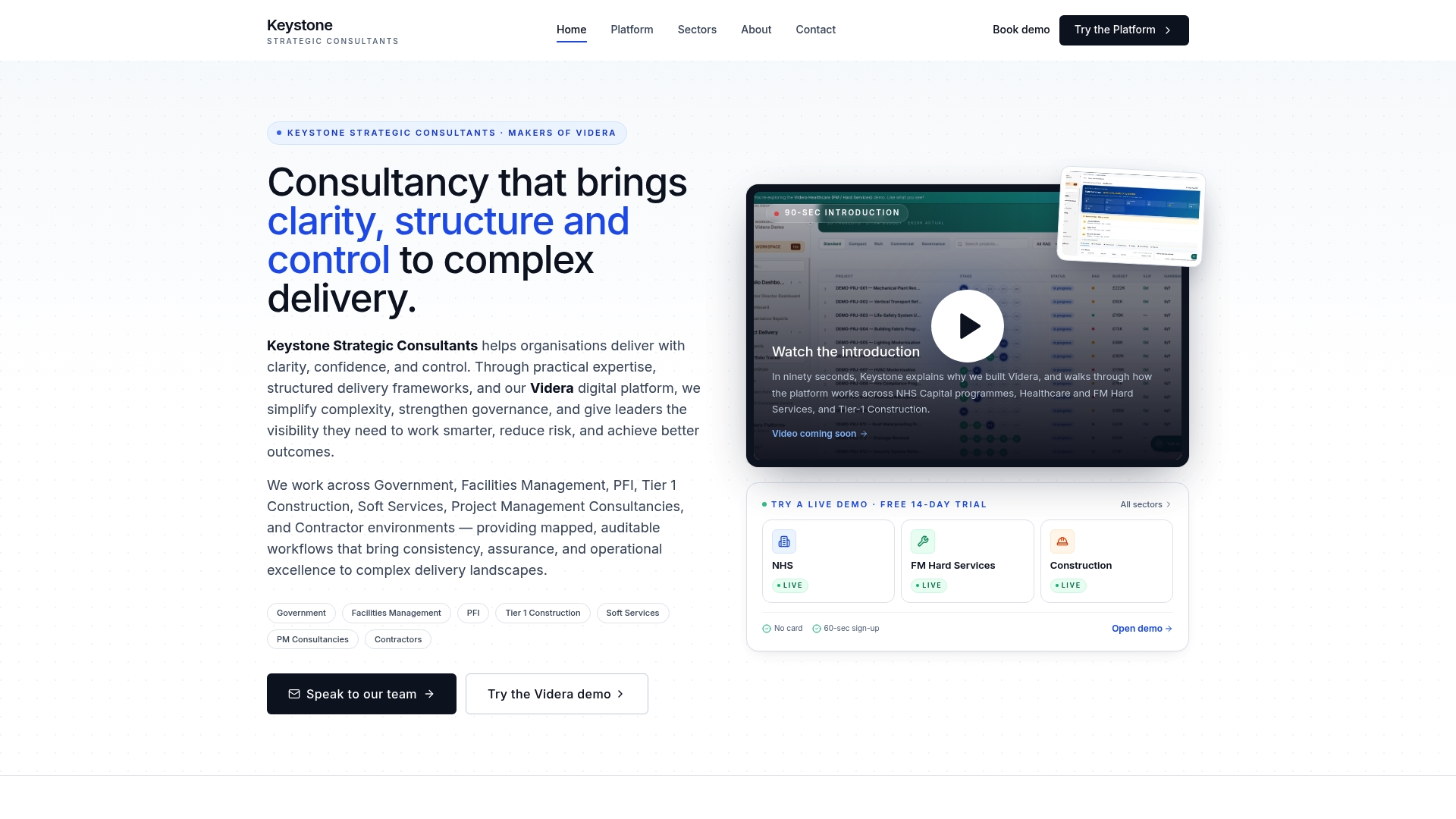
A typical engagement starts small: a discovery phase mapping your highest-risk or highest-volume processes, a pilot running those maps through Videra Healthcare to test how automated exception reporting fits your existing governance structure, then a phased deployment across the rest of the service. This suits NHS administrators and operational leads who already know their processes need mapping but do not have spare capacity to also build the reporting infrastructure that keeps those maps honest over time. If your organisation runs a broader mix of clinical and estates-related delivery work, the wider consultancy offering covers governance design and workflow mapping across departments, not just one service line.
If you already have maps sitting in a drawer from a previous improvement project, that is a reasonable place to start a conversation rather than beginning again from scratch. Request a demonstration of how Videra Healthcare turns a mapped process into a live governance record, and see what it would take to bring your own maps into it.
Sources
Every claim about method in this guide traces back to publicly available primary sources, and it is worth going directly to them before running your first workshop.
The AHRQ workflow mapping guidance is the clearest starting point, covering diagram types and the levels framework in plain terms. Pair it with the AHRQ process mapping job aid, a free downloadable checklist built specifically for facilitating a live session, including the materials list and the sequencing steps this guide walks through in detail. For the evidence base behind why mapping works, the systematic review published via PMC summarises findings across multiple studies on shared understanding and local adaptation. If your interest leans toward patient experience rather than operational steps, the patient journey mapping literature entry sets out the co-design methodology that distinguishes journey mapping from standard process mapping.
- How to Map Workflows in Health Care Settings — AHRQ
- Process mapping in healthcare: a systematic review — PMC
- Patient journey mapping literature (PubMed entry)
FAQ
What is process mapping in healthcare?
Process mapping in healthcare is the visual documentation of how work actually happens, capturing each step, decision point, and handoff in a clinical or administrative process. It differs from a written protocol because it must reflect real practice, including workarounds, as confirmed by AHRQ's workflow mapping guidance.
What are the 7 flows of healthcare?
This term usually refers to the operational flows commonly tracked in healthcare improvement work: patients, staff, medication, supplies, equipment, information, and process/value. Definitions vary between organisations, so it is worth checking which framework your own quality improvement team uses before assuming a fixed list.
What is L1, L2, and L3 process mapping?
L1 is a high-level, enterprise or value-chain view suited to leadership decisions. L2 breaks that into major workflow stages, and L3 documents the detailed operational steps within a stage, the level most improvement teams use day to day, following the levels framework described in AHRQ's mapping guidance.
What is workflow mapping?
Workflow mapping is the practice of documenting a sequence of tasks, decisions, and handoffs visually, typically as a flowchart or swimlane diagram, so a team can see the actual process rather than rely on individual memory. It is validated through direct observation and staff involvement, following steps set out in the AHRQ job aid.
How much does Keystoneconsulting's mapping and governance platform cost?
Pricing for Videra Healthcare and Keystoneconsulting's consultancy engagements is not published, since costs depend on the scale and number of processes involved. Current pricing details are available directly through Keystoneconsulting.