
An executive status report is a one-page decision-support snapshot: overall health with trend, what changed since last time, what you need from the reader, and the risks that could derail delivery. It exists to compress weeks of project work into ninety seconds of reading. Brevity, repeatability and honest colour calls are what separate a report executives trust from one they skim and bin.
TL;DR:
- RAG thresholds should be fixed at the start of each quarter and not changed, to maintain trust and consistency in reporting.
- Weekly reports are suitable during high-risk phases, while monthly or fortnightly cadences work better for steady-state projects.
- Data sources must remain consistent, with timestamps and owner verification, to prevent errors and stale information in reports.
- The report should combine quantitative metrics with qualitative context, such as stakeholder sentiment or early signs of risk, in concise sentences.
- Automating report generation through dedicated platforms like Videra reduces manual errors, streamlines workflows, and ensures audit readiness.
Table of Contents
- What goes in a one-page executive status report
- How do you write status updates executives actually trust?
- How often should you send executive project status reports?
- A worked one-page executive status report you can copy
- Trust signals executives look for before they believe your report
- Keystone perspective: governance-driven reporting and automation with Videra
- Best practices for connecting executive reports to wider reporting systems
- Tailoring executive reports for different stakeholder groups
- Visual presentation techniques that make status reports easier to read
- Tools and software for building and sending executive status reports
- Combining qualitative context with the numbers
- How do you check your data is accurate before it goes in the report?
- Author perspective: one leadership habit to improve executive reporting
- Fixing manual reporting bottlenecks with Videra
- Sources
- FAQ
What goes in a one-page executive status report
A one-page executive status report earns its name by being genuinely one page, which means every field has to justify its place. The structure below is the backbone Keystoneconsulting uses when helping clients rebuild their reporting from scratch.
Header block. Project name, project owner, reporting period, and a version number. Skip the version field and you'll spend half a steering meeting arguing about which draft is current.
Top-line health row. This is the line executives read first and sometimes only. It needs four things sitting together:
- RAG status (red, amber, green)
- Trend arrow (improving, static, worsening)
- Confidence level (how sure you are the RAG call will hold until next report)
- Named owner accountable for that status
Below the health row, a single sentence answers the only question that matters: are we on track? Not "progress continues as planned" — that tells an executive nothing. Write "On track for the March go-live, contingent on vendor testing completing by the 20th."
From there, the report breaks into short, scannable blocks:
- What changed — one or two bullets on what's different since the last report, not a recap of everything that happened.
- Upcoming priorities — the next milestones, each with a date, not a vague window.
- Critical issues and risks — named owner and current mitigation status for each, not a running log.
- Financial snapshot — one line: budget position, forecast variance, and whether that variance is improving or worsening.
- Decisions needed — the explicit ask, with a deadline.
Anything that doesn't fit those categories goes in an appendix, linked or attached, never squeezed onto the front page. A one page status report only stays one page if the detail lives elsewhere.
How do you write status updates executives actually trust?
RAG on its own tells an executive where you are. RAG with a trend arrow tells them where you're heading, and that second piece often matters more than the colour itself. A project sitting on amber but trending green is a very different conversation to one sitting on amber and sliding towards red, even though the headline colour is identical. Practitioner guidance on report design increasingly treats trend as inseparable from RAG for exactly this reason.

Every report should end with an explicit ask, not a hope that someone reads between the lines. The pattern is simple: name the decision, set a deadline, state the cost of delay, and name who owns the decision. "Need to sign off on the £40k contingency spend by Friday, or the site remobilisation slips two weeks" gives an executive everything they need to act in one line.
Keep the summary to one line plus two or three bullets. Executives don't want the technical detail that justifies your RAG call, they want the call and what it means for them.
Pro Tip: Fix your RAG thresholds at the start of a quarter and don't touch them. A project manager who redefines "amber" every month erodes trust faster than one who reports bad news consistently.
Pull fields from source systems rather than retyping them from memory. A consistent format with stable thresholds is one of the strongest predictors of whether a sponsor actually reads your reports or files them.
How often should you send executive project status reports?
Weekly suits fast-moving delivery phases: active construction, live incident response, anything where a week's silence hides real drift. Monthly suits steady-state programmes where a weekly cadence would just generate noise without new information.
A few rules of thumb:
- Weekly during high-risk phases (go-live, commissioning, migration cutover)
- Fortnightly for mid-tempo delivery where risks shift but slowly
- Monthly for governance-level portfolio reporting to a board
Avoid noise by using trend windows rather than raw week-on-week snapshots, and aggregate minor fluctuations rather than reporting every small variance as news. Time your report to land before the relevant steering committee, and pre-wire any decision items with the sponsor beforehand. A cold ask at a governance meeting rarely gets a fast yes; a warmed-up one usually does. Good portfolio governance treats the reporting cadence as part of the decision cycle, not a separate admin task.
A worked one-page executive status report you can copy
Strip everything back and a status report reduces to four lines an executive can read in under a minute, a discipline echoed in most practitioner status templates:
- Status and trend: Amber, improving. Confidence: high.
- What changed: Vendor testing completed two days early; procurement delay on structural steel resolved.
- What you need: Approve the £15k expedite fee for steel delivery by Thursday, or the frame erection slips one week.
- At risk: Site access permit renewal, owner: J. Okafor, mitigation: expedited application submitted, decision due June 30.
Each line pulls from a live source rather than memory. Status and trend come from your RAG history and baseline schedule variance. "What changed" comes from your RAID log's recent entries. "What you need" comes from whatever decision is genuinely blocked. "At risk" comes straight from the top of your risk register, sorted by impact.
A quick fill-in checklist before you paste this into an email or slide:
- Pull the latest schedule variance and RAID entries, don't rely on last week's memory
- Confirm every named owner is still accurate
- Check the ask has a real deadline, not "soon."
- Read it aloud in under 60 seconds. If it's longer, cut a bullet
Trust signals executives look for before they believe your report
Most credibility failures aren't dramatic. They're stale data, a RAG colour that quietly shifts red to amber with no explanation, a report with no ask at all, or slippage that surfaces for the first time in a report rather than in a conversation beforehand.
Minimum trust signals worth including:
- Alignment to a valid, baselined schedule with the critical path clearly identified
- A cost position backed by reasonable estimating practice, ideally linked to earned value management
- Date stamps on every data point, so nobody has to ask "as of when?"
- Named owners on every issue and risk, not "the team"
Only around half of organisations with low process maturity give their executives most of the benefits data they need to govern well — mature organisations are twice as likely to have that data available. State uncertainty plainly rather than hiding it: a confidence percentage and a named contingency line beat false precision every time.
Keystone perspective: governance-driven reporting and automation with Videra
Manual report assembly is where most reporting programmes quietly fail. Someone retypes numbers from three systems into a slide every Friday, and the numbers are stale before the ink dries. Governance design paired with mapped workflows removes that retyping step by defining, once, where each field lives and how it flows.
Videra takes that mapped structure and turns it into configurable, audit-ready executive views, pulling from schedule, RAID and cost data rather than a manual narrative. Consultancy makes sense when reporting failures are structural; incremental fixes work fine when the problem is just one broken habit.
Best practices for connecting executive reports to wider reporting systems
An executive status report shouldn't exist in isolation from your organisation's other reporting layers. Treat it as the top of a pyramid: portfolio dashboards, programme-level reports, and team-level trackers all feed upward into it, and the numbers at each layer need to reconcile.

The most common failure is a top-line RAG that contradicts the detail underneath it, usually because the executive report was compiled from memory rather than pulled from the same source data as the team-level reports. Fix that by anchoring every field in the executive view to the same system of record used lower down: the same schedule baseline, the same risk register, the same cost tool.
Aggregating disparate metrics into a single structured view also surfaces systemic issues earlier than reading isolated component reports separately, because patterns across projects become visible only once the data sits in one place.
Where an organisation runs a portfolio management office, the executive report should slot into that PMO's existing rhythm rather than run on a separate schedule with separate templates. Two parallel reporting systems, one for the PMO and one for individual project sponsors, is a reliable way to generate contradictory numbers and lose trust in both. Standardise the RAG thresholds, the reporting periods, and the terminology across every layer, and reviewers stop having to translate between reports before they can act on them.
Tailoring executive reports for different stakeholder groups
A single sponsor and a full board rarely want the same level of detail, and writing one report for both usually means it satisfies neither. A programme sponsor who sits close to delivery will want the "what changed" section detailed enough to spot early drift. A board member seeing the project once a quarter needs the health line, the ask, and almost nothing else.
The fix isn't multiple reports built from scratch. It's one underlying data set with different views layered on top. Keep the four-line structure identical, but vary the depth of the appendix: a delivery sponsor gets a fuller RAID extract attached, a board pack gets a portfolio roll-up showing this project alongside others competing for the same capital.
Regulatory and clinical stakeholders, common in healthcare delivery, often need an additional compliance or audit-readiness line that a construction sponsor wouldn't expect to see. Facilities management stakeholders tend to care more about statutory compliance deadlines than schedule variance. Build your template with a core that never changes and a small set of audience-specific fields that switch on or off depending on who's reading.
The test for any tailored version is the same: could this reader make their next decision from this page alone, without a follow-up call to ask what a term means or where a number came from?
Visual presentation techniques that make status reports easier to read
Colour does most of the heavy lifting in an executive report, which is exactly why inconsistent colour use is so damaging. Keep your RAG palette fixed across every report and every project in a portfolio, so a reader scanning ten projects in a portfolio pack can compare them at a glance without checking a legend each time.
Trend arrows work best placed directly beside the RAG dot rather than in a separate column, because executives read status and direction as one combined signal, not two things to reconcile mentally. A small sparkline showing the last four or five RAG calls does more for credibility than a paragraph explaining the history, because it lets the reader verify consistency for themselves.
Resist the urge to add charts that need a caption to explain them. If a graph needs three sentences of explanation before an executive can read it, it belongs in the appendix, not the front page. The same principle behind clear marketing dashboards applies here: a chart should be legible at a glance or it isn't earning its space.
White space matters more than most project managers assume. A page crammed with eight fonts, three colours of shading, and dense paragraph text reads as noise regardless of how good the underlying data is. Leave breathing room around the health row specifically, since that's the section eyes land on first.
Tools and software for building and sending executive status reports
Most teams start in Excel or PowerPoint, and for low-maturity reporting that's a reasonable place to stay for a while. The trouble starts when the same spreadsheet gets copied, renamed and re-edited by three different people, and nobody's sure which version is current.
The next step up is usually a dashboarding layer, something like Power BI or Tableau, pulling live figures from a project management tool rather than a static file. That solves the staleness problem but often creates a new one: dashboards built for analysts tend to show far more detail than an executive wants, and someone still has to manually distil that detail into the four lines a sponsor actually reads.
Purpose-built governance platforms solve both problems at once, mapping the workflow that produces each field and generating the one-page view automatically rather than requiring a human to compile it each week. That's the gap Keystoneconsulting's Videra platform is built to close, and it's worth returning to once a reporting programme outgrows spreadsheets.
Whatever tool you use, distribution matters as much as creation. A report emailed as a static PDF ages the moment it's sent. A report published to a shared portfolio dashboard stays current between reporting cycles, which matters for anyone checking status outside the regular reporting rhythm.
Combining qualitative context with the numbers
Numbers alone rarely tell an executive the full story. A project can be green on every metric and still be heading for trouble because a key supplier relationship has soured, or a client stakeholder has gone quiet. That kind of signal doesn't show up in a schedule variance calculation, but it belongs in the report.
The "what changed" section is the natural home for this. Rather than treating it purely as a milestone log, use it to flag qualitative shifts too: a change in stakeholder sentiment, a resourcing risk that hasn't yet hit the RAID log, an early warning from a site visit. Keep it to a single sentence per item so it doesn't turn into a narrative essay.
Confidence statements work the same way. Instead of a bare RAG colour, add a short qualifying phrase: "Green, but confidence dependent on subcontractor mobilising by the 15th." That single clause carries context a number never could, and it gives the reader a reason to ask a follow-up question if they want more.
Resist the temptation to quantify everything just to look rigorous. A risk score forced onto a soft issue, like team morale or a strained client relationship, often creates false precision. Say plainly what you're seeing and let the number-based metrics carry the load where numbers genuinely apply.
How do you check your data is accurate before it goes in the report?
The fastest way to lose an executive's trust is to report a number that turns out to be wrong the following week. Before any figure lands on the page, trace it back to its source system rather than trusting whatever was in last week's version of the report.
A few checks worth building into your weekly or monthly routine:
- Reconcile the schedule variance figure against the actual baseline, not a working copy that's drifted from it
- Confirm every named risk or issue owner is still the right person, since ownership changes are one of the most common silent errors
- Cross-check the financial line against the latest cost report rather than an estimate carried forward from two cycles ago
- Timestamp every data pull so a reader can see exactly how current the figures are
Where possible, automate the pull rather than retyping figures by hand. Manual consolidation is one of the most common causes of stale or simply wrong data reaching an executive's desk, because every manual step is another chance for a transcription error or an outdated snapshot to slip through unnoticed.
Author perspective: one leadership habit to improve executive reporting
If there's one habit worth adopting above everything else in this article, it's fixing your RAG thresholds at the start of a quarter and refusing to touch the format until the quarter ends. Most credibility problems in executive reporting come from constant small redesigns, not from bad news itself. Executives forgive amber. They don't forgive a report that looks different every month.
— Peter
Fixing manual reporting bottlenecks with Videra
This solution addresses the challenge of manual weekly reporting that is prone to errors and disputes over accuracy. The described platform maps workflows and integrates schedule, RAID, and cost data into a configurable executive view that can generate one-page reports from live data sources rather than manual compilation.
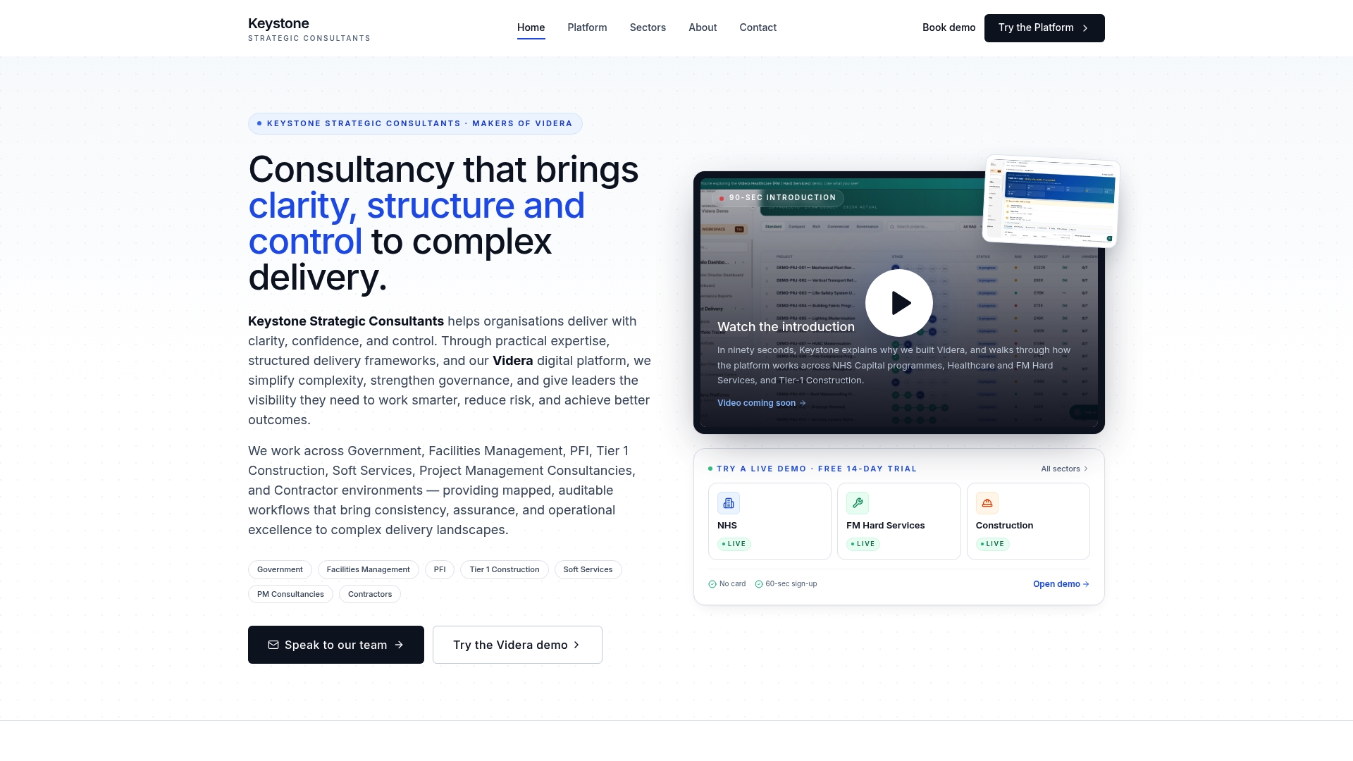
For organizations in regulated sectors, specific platform capabilities support governance and audit trail requirements. Construction and facilities teams with similar site-level reporting challenges can use tailored platform solutions designed for their data needs.
Contact Keystoneconsulting's consultancy team when the problem is structural, repeated manual reports, inconsistent RAG calls across projects, or an audit-readiness gap that needs fixing at the governance level rather than patched report by report. Where the fit is simpler, start by reviewing Videra PM directly to see how the mapped workflow approach applies to your own reporting cycle.
Sources
For the standards behind the trust signals in this article, see the GAO's schedule risk analysis guidance, the GAO Cost Estimating and Assessment Guide, and SEI's dashboard guidance. Keystoneconsulting's own RAG credibility guide expands on threshold discipline.
- GAO-16-89G: Schedule risk analysis guidance
- Cost Estimating and Assessment Guide (GAO)
- Strengthening benefits awareness in the C-suite (PMI / EIU)
- Dashing all the way: defining the best dashboard for your program (SEI)
FAQ
What does executive level reporting mean?
Executive level reporting means summarising project performance for senior leaders who need to make decisions, not track daily detail. It focuses on overall health, trend, risks and a specific ask rather than granular task-level status.
What are the three main elements of a status report?
Most status reports centre on overall health (RAG plus trend), what has changed since the last update, and what the reader needs to do about it. A fourth element, key risks with named owners, is standard in most executive templates as well.
What should a status report include?
A status report should include a header with project and reporting period, a top-line RAG and trend, a one-line summary, what changed, upcoming priorities with dates, risks with owners, a financial snapshot, and any explicit decisions needed. Detail beyond that belongs in an appendix rather than the main page.
Can you provide an example of an executive report?
A four-line executive one-pager might read: status amber and improving, what changed (a supplier delay resolved early), what you need (approval of a £15k expedite fee by Thursday), and what's at risk (a site permit renewal with a named owner and mitigation date). Keystoneconsulting's Videra platform can generate this kind of view automatically from live project data rather than a manually compiled slide.