
RAG status reporting scores a project's health as Red, Amber or Green so stakeholders can spot trouble without reading a full report. The rule that makes it useful: every colour must sit on an objective threshold, not a gut feeling, and carry an owner, evidence and a next action. Skip that, and you're just decorating a spreadsheet. This matters most to PMs, sponsors and PMO leads who need to trust the colour before they act on it.
TL;DR:
- Setting clear, written thresholds for each RAG color ensures objective measurement and reduces misinterpretation among stakeholders.
- Tracking both lagging and leading indicators allows early detection of project risks before they escalate into red statuses.
- Attaching ownership, specific recovery actions, and review dates to each dimension transforms color codes into actionable insights.
- Automating metric collection from source systems helps uncover issues early, preventing delays from subjective or delayed reports.
- Regularly reviewing and normalizing amber as a healthy status fosters honest reporting and improves early-warning systems.
Table of Contents
- What each RAG colour actually means
- Which dimensions to track and how to measure them
- Setting objective thresholds and the evidence to back them
- Turning colour into action: escalation and recovery plans
- Building the report: templates and dashboard visuals
- Why RAG status reporting fails, and how to stop it
- How often to report, and to whom
- How Keystoneconsulting applies this in practice
- Peter's take: the colour was never the point
- Get objective RAG status reporting without building it from scratch
- Sources
What each RAG colour actually means
Green, Amber and Red look simple until three people on the same steering committee interpret them three different ways. That's the actual failure mode of most RAG status reporting, and it's fixable with clear, written definitions attached to numbers rather than opinions.
Green means the dimension is on track against its baseline, within an agreed tolerance, with no unresolved issue requiring escalation. A schedule sitting at 96% of planned progress with no open blockers is Green. Not "probably fine".
Amber means the dimension has drifted outside tolerance but remains recoverable with a defined action already underway. A budget running 15% over forecast, with a mitigation plan and an owner already assigned, is Amber. Amber is a warning with a plan attached, not a shrug.
Red means the dimension has breached tolerance and recovery needs a decision or resource from someone above the project team. A milestone that's slipped past its contractual date without an agreed recovery route is Red, full stop.
The bigger mistake isn't misjudging a colour. It's rolling everything into one overall RAG figure instead of rating each dimension separately. A single "Amber" for the whole project tells a sponsor almost nothing, because it might mean the budget is fine and the schedule is collapsing, or the reverse. Designveloper's explanation of RAG status makes the same point: colour without context is decorative, and that applies just as much to a blended score as to a bare colour with no evidence behind it.
Rate each of these separately wherever they're material to the project:
- Schedule — progress against baseline dates
- Budget — spend versus forecast, and remaining contingency
- Scope — creep, cuts, or unresolved change requests
- Quality — defect counts, rework rate, test pass rate
- Risks — number and severity of open risks above the tolerance line
- Dependencies — status of inputs from other teams or vendors
- Resources — availability against the resourcing plan
Some organisations bolt on a fifth colour: Blue for "not yet started" or "on hold", and Grey for "not applicable this period". These earn their place only when a project genuinely has phases sitting outside the RAG scale. Adding them for the sake of variety just muddies a system whose entire value is being instantly readable.
Which dimensions to track and how to measure them
A RAG report is only as good as the indicators feeding it. The mistake most teams make is picking dimensions that sound comprehensive but measure nothing precise. "Team morale: Amber" tells a sponsor nothing they can act on. A measurable indicator does.
Here's a working set, paired with indicators that hold up under scrutiny:
- Schedule — % complete versus baseline plan; days of float remaining on the critical path
- Budget — actual spend versus forecast at this stage; contingency drawdown rate
- Scope — number of open change requests; cumulative scope variance from baseline
- Quality — open P1/P2 defect count; test pass rate; rework hours as a share of total effort
- Risks — count of risks scored above the agreed severity threshold; risk trend over the last three reporting periods
- Dependencies — % of external deliverables received on time; days late on the longest-outstanding dependency
- Resources — resourcing plan versus actual headcount; unfilled critical roles
The distinction that separates a reactive report from a genuinely useful one is leading versus lagging indicators. A lagging indicator tells you what already happened, budget variance, missed milestone, defect count. A leading indicator tells you what's about to happen. Cycle time creeping upward, code review pickup slowing, test coverage trending down: these move before the RAG colour does, which is exactly why CodePulse's guide to RAG reporting recommends building them into dashboards deliberately, rather than waiting for the lagging metric to force a colour change nobody saw coming.
Pro Tip: If a dimension's status has never changed in six reporting cycles, it's either genuinely stable or nobody's actually measuring it. Ask which, before a board does.
Resist the temptation to track everything. A report with eleven dimensions and thirty indicators isn't more rigorous, it's unreadable. Pick the four to seven dimensions that are actually material to this specific project's risk profile, and drop the rest. A construction programme probably needs dependencies and resources front and centre; a software delivery might weight quality and scope more heavily. The right set is the one a sponsor can absorb in ninety seconds.
Setting objective thresholds and the evidence to back them
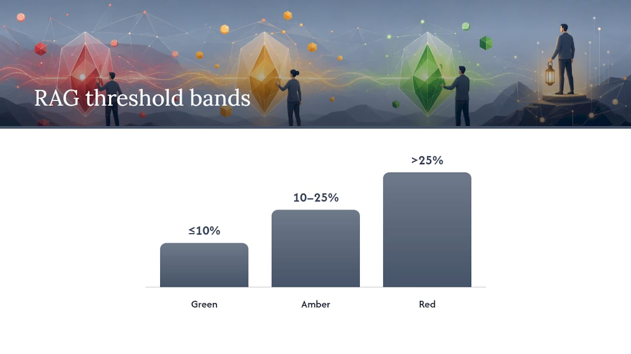
Thresholds turn RAG status reporting from opinion into measurement, and they need to be written down before the project starts drifting, not invented in the meeting where someone's trying to justify a colour.
A workable starting template, adaptable by dimension:
- Green: performance within 10% of the baseline plan
- Amber: performance 10 to 25% behind or over baseline, with a recovery action already identified
- Red: performance more than 25% behind or over baseline, or a hard deadline breached with no agreed recovery route
These bands, drawn from practitioner guidance on setting RAG thresholds, work as a sensible default. They're not universal. A safety-critical dimension, a hospital go-live date, a structural inspection milestone, deserves a tighter band; even a 5% slip might warrant Amber given the downside of getting it wrong. A low-volume, low-risk dimension can tolerate a wider band without losing its early-warning value.
Deciding between absolute and relative thresholds matters too. A £2 million programme running £150,000 over budget is a 7.5% variance, comfortably Green under the 10% rule. But if that £150,000 represents the entire remaining contingency, an absolute threshold on remaining contingency (say, Red below 5% of budget left) catches a real problem the percentage-based rule misses entirely. Use both where the stakes justify it.
Every colour needs four pieces of evidence attached, not just the colour itself:
- Metric snapshot — the actual number behind the status, not a description of it
- Owner — the named individual accountable for that dimension, not a team name
- Recovery action — what's actually being done, with enough specificity that someone could check progress
- Review date — when this status gets reassessed, so Amber doesn't quietly become permanent
That's the core discipline in Designveloper's breakdown of RAG status: a colour without an owner and a next action is a placeholder, not a status.
Turning colour into action: escalation and recovery plans
A RAG colour that doesn't trigger a specific action is just a mood indicator. The fix is attaching an action type to every Amber and Red item, so the reader knows immediately what's being asked of them.
Four action types cover most real situations:
- Decision needed — a sponsor or steering committee must choose between defined options
- Resource needed — additional budget, headcount or specialist input required to recover
- Scope trade — a deliberate reduction or reprioritisation of scope to protect the schedule or budget
- Vendor escalation — a third-party dependency needs contractual or relationship-level intervention
Attaching one of these to every Amber or Red row, rather than a vague "monitoring closely", is what makes a report decision-ready rather than merely informative, a distinction Designveloper's guide draws out clearly.
Response timeframes need to match severity. A Red with a decision-needed tag should get a response within one to two working days, not wait for the next scheduled steering meeting. An Amber with a resource-needed tag can usually wait for the standard weekly cycle, provided the recovery action is already moving.
A recovery-plan row you can paste straight into a status report:
| Field | Example entry |
|---|---|
| Dimension | Schedule |
| Status | Amber |
| Evidence | days behind baseline on critical path |
| Owner | J. Okafor, Delivery Lead |
| Action type | Resource needed |
| Recovery action | Add one senior developer for 3 weeks; reprioritise two P3 items |
| Review date | Next Friday's steering meeting |
Keep this row structure identical every week. Consistency is what lets a sponsor scan five reports in five minutes and trust what they're reading, instead of hunting for where the owner field moved this time.
Building the report: templates and dashboard visuals
The most useful RAG status update fits on one page and answers three questions in order: what's the headline, what's the evidence, and what happens next. Anything more belongs in an appendix, not the summary.
A minimal, copy-ready structure:
- Executive summary — two to three sentences: overall trajectory, the single biggest risk, and whether anything needs a decision this cycle
- Per-dimension RAG table — colour, evidence snapshot, owner, next action for each rated dimension
- Trend note — has this dimension moved since last report, and in which direction
For the executive summary and per-dimension detail, the compact template recommended across practitioner guidance holds up well:
| Field | What it captures |
|---|---|
| Headline colour | Single RAG status for this dimension |
| One-line reason | The evidence behind the colour, in plain language |
| Owner | Named individual, not a team |
| Next action | What's happening, specifically |
| Review date | When this gets reassessed |
That five-field structure, drawn from CodePulse's RAG reporting guide, is deliberately narrow. It resists the urge to add a sixth field "just in case," which is usually how status reports balloon into documents nobody reads in full.
Dashboards add value where a static table can't: showing direction. A few elements earn their place on a project dashboard:
- Trend sparklines next to each dimension, showing the last four to six periods, not just the current colour
- Leading-indicator widgets sitting alongside the lagging RAG colour, so a viewer sees the warning before the colour changes
- Heatmaps for portfolio views, where dozens of projects need scanning at once and colour density matters more than individual detail
Portfolio roll-ups deserve their own discipline. Rolling twenty projects into one heatmap is useful for a PMO scanning for outliers, but it should always link back to the individual project's evidence, never stand alone as the full picture. A heatmap tells you where to look. It doesn't tell you what's actually wrong.
Why RAG status reporting fails, and how to stop it
Most RAG failures aren't caused by bad colour choices. They're caused by an incentive structure that rewards optimism. A project manager who reports Amber two weeks running starts to look like they can't manage their own project, even when Amber is the honest answer, so the temptation is to hold Green until the problem is undeniable and arrives as a Red nobody had warned about.
That pattern, over-reporting Green until a late Red forces an unplanned crisis response, is the single most damaging failure mode in project governance. It removes the early-warning value that's the entire point of the traffic-light system.
Two categories of fix work, and they need to run together.
Technical controls:
- Pull metrics automatically from source systems (time tracking, defect trackers, financial systems) rather than relying on self-reported percentages
- Apply the same objective thresholds to every project in a portfolio, so no team can quietly define its own generous version of Green
- Have someone outside the immediate delivery team spot-check evidence against the reported colour periodically
Cultural fixes:
- Explicitly normalise Amber as a healthy, expected status, not a performance failure. CodePulse's guidance makes normalising amber a central recommendation, precisely because teams that fear it stop reporting it
- Treat Red as a trigger for a decision, not a trigger for blame. If Red reliably produces a resourcing conversation rather than a difficult conversation about performance, people report it honestly
- Reward the PM who flagged Amber early over the one who reported Green right up until the deadline slipped
Pro Tip: If every project in your portfolio is reporting Green, you don't have a well-run portfolio. You have a reporting problem hiding a delivery problem.
How often to report, and to whom
RAG status reporting only works when the level of detail matches who's reading it. A steering committee drowning in operational metrics stops reading the report; a delivery team getting only a headline colour has nothing to act on. Match cadence and depth to the audience.
A workable mapping:
- Delivery team — daily or twice-weekly, informal, focused on leading indicators and blockers, not a formal RAG document
- Project/delivery leads — weekly, full per-dimension RAG table with evidence, owner and next action for every rated dimension
- Steering committee/sponsor — fortnightly or monthly, headline colours, key trends, and anything needing a decision this cycle
- Board/executive — monthly or quarterly, portfolio-level roll-up, exceptions only, impact framed in business terms
Senior stakeholders need less detail, not less rigour. Guidance on communicating RAG status to stakeholders is direct on this: a board wants the colour, the business impact, and the decision being asked of them, not the underlying metric that produced the colour. Handing a board the same six-column operational table a delivery lead sees isn't thoroughness, it's a failure to translate.
The trap to avoid is changing what a colour means depending on who's asking. If Amber means something different in the board pack than it does in the team standup, nobody trusts either report. Keep definitions and thresholds identical across every audience; only the depth of supporting detail should change.
How Keystoneconsulting applies this in practice
Two decades spent inside healthcare, construction and facilities delivery programmes teaches a specific lesson: the projects that go quietly wrong are rarely the ones with an honest Red. They're the ones where Amber sat unreported for months because nobody had a threshold to test it against.
On one governance engagement, tightening the threshold definition for a dependency dimension, from a vague "on track" judgement to a measured days-late figure, surfaced a supplier delay trend three reporting cycles before it would have forced a Red under the old subjective system. On another, pulling defect data automatically into the reporting workflow rather than relying on a manual weekly count caught a quality dimension drifting into Amber territory a full sprint before anyone would have flagged it manually.
The pattern repeats across sectors: the earlier a threshold catches drift, the cheaper the recovery. Automating the metric pull removes the lag between reality and the report, which is where most late-stage crises actually originate.
The Videra PM platform is built around that lesson, enforcing evidence, owner and next-action fields at the point of entry so a status can't be submitted as a bare colour with nothing behind it.
Peter's take: the colour was never the point
Most advice on RAG status reporting obsesses over getting the colour right. That's the wrong fight. The actual research points somewhere else entirely: the colour is only ever as trustworthy as the threshold and evidence sitting behind it, and most organisations never write those down properly.
Conventional wisdom treats RAG as a communication tool, a way to summarise status for people too busy to read a full report. That's true, but it undersells what it should be: an early-warning system that only works if Amber is allowed to exist without punishment. Every failure mode in this article, gaming, watermelon projects, late Reds, traces back to teams treating Amber as an admission of failure rather than a normal, expected signal.
If you take one thing from this, prioritise the threshold conversation before the next reporting cycle, not the dashboard design. A beautiful dashboard built on subjective colours is still guesswork with better typography. Fix the definitions first. Everything else, templates, cadence, visuals, gets easier once the colour actually means something.
— Peter
Get objective RAG status reporting without building it from scratch
Keystoneconsulting is the practical route to RAG status reporting that holds up under scrutiny, without spending months building threshold logic and evidence templates from a blank spreadsheet. The Videra PM platform maps your project's workflows and applies objective thresholds automatically, pulling metrics from source systems so a colour can't be entered without a snapshot, an owner and a next action attached.
That matters most for teams that have tried RAG reporting before and watched it decay into subjective guesswork within a few months, exactly the failure pattern this article walks through. Keystoneconsulting's twenty years across healthcare, construction and facilities delivery means the threshold logic isn't theoretical; it's built from programmes that have already been through the late-Red crisis this system exists to prevent. If your reports currently rely on memory and good intentions, get in touch with Keystoneconsulting to see how Videra applies this in your sector.
Sources
For readers who want to go deeper: CodePulse's RAG reporting guide is the strongest source on setting thresholds and leading indicators. Designveloper's explainer covers the evidence-and-action template well. For stakeholder communication specifically, prodSens.live's piece on communicating RAG status is worth the ten minutes.
- RAG status reporting guide — CodePulse
- What Is RAG Status In Project Management? Red-Amber-Green Explained - Designveloper