A program health dashboard is a live rollup that turns scattered project updates into one evidence-based view of what's on track, what's stalled, and who owns the fix. The single outcome it must deliver is honesty: not what a project manager said last Tuesday, but what the underlying data shows right now. This article gives you the exact views, metrics, and starter templates to build one, including zero-dependency examples you can deploy today, without touching a procurement process.
TL;DR:
- A program health dashboard should base its status solely on live, underlying data rather than manual updates or subjective inputs.
- Key metrics include schedule variance, stalled projects, budget burn, and risk counts, with specific calculations to identify early warning signs.
- Use simple, zero-dependency templates for quick deployment or progress to more integrated, enterprise-level tools as needs grow.
- Centralizing and automating status logic ensures transparency, auditability, and guards against reporting drift or manipulation.
- Start with a minimal dataset to build a functional dashboard in a day, then scale gradually according to project complexity and governance requirements.
Table of Contents
- What does a program health dashboard show?
- What metrics should you track, and how are they calculated?
- How do you choose or build a starter dashboard?
- A practitioner's view on governance and audit readiness
- Build a working dashboard in a day: templates and a starter checklist
- When to keep it simple and when to invest further
- How Keystoneconsulting brings governance to your program dashboard
- Sources
What does a program health dashboard show?
Most working dashboards organise around five views, and each one answers a different question for a different audience.
- Portfolio scoreboard: a single-screen ranking of every project by status, usually red/amber/green, built for a PMO scanning fifteen projects in ninety seconds.
- Project health: the detail behind one project's colour, including scope, budget, and the specific risk driving concern, used when a programme lead needs to prepare for a difficult conversation.
- Timeline or Gantt view: dependencies and milestones laid out chronologically, most useful when an executive asks "what happens if this slips two weeks?"
- Risks and issues: a live log ranked by severity and age, not a static register nobody opens between steering meetings.
- Resources and financials: burn rate against forecast, capacity against demand, the numbers that turn a status conversation into a funding conversation.
The visual language matters as much as the data structure. Pulse strips (thin colour bars showing recent movement) catch drift before it becomes a crisis. Trend cards show direction, not just position. Heatmaps let a programme lead spot the two or three projects generating disproportionate risk without reading a single line of narrative text.
What metrics should you track, and how are they calculated?
The metric that causes the most arguments is "percent complete," mainly because teams calculate it based on effort spent rather than schedule position. The more useful version compares actual progress against where the project ought to be, given its start and end dates, then flags a gap as at risk the moment the two diverge past a set tolerance.
Days-since-last-update is the metric most dashboards skip and shouldn't. A project untouched for 30 days isn't necessarily failing, but it's certainly not being managed, and that distinction earns its own status: stalled. The zero-dependency portfolio dashboard on GitHub builds this rule directly into a single classify() function, flagging anything untouched past the threshold automatically.
| Metric | Calculation | What it signals |
|---|---|---|
| Schedule variance | Actual % complete minus expected % complete | Whether delivery is ahead, on track, or slipping |
| Stall flag | Days since last update vs. threshold (e.g. 30 days) | Whether the project is being actively managed |
| Budget burn | Actual spend / planned spend to date | Cost trajectory against the approved baseline |
| Cost variance | Budget at completion minus forecast at completion | Whether overruns are emerging early enough to act |
| Open risk count | Live risks above a severity threshold | Exposure that hasn't yet become an issue |
Pro Tip: Set your expected percent complete using schedule position, not a manual estimate. A project 60% through its timeline should show roughly 60% complete; anything wildly below that is your earliest and cheapest warning sign, well before the VividCharts programme rollup approach would surface it as a formal risk.
How do you choose or build a starter dashboard?
The right starting point depends less on ambition and more on where you're allowed to deploy software.
- Zero-dependency, one-file templates. A single HTML file with embedded JSON or CSV runs in any browser, needs no build pipeline, and can be emailed or dropped on SharePoint in a locked-down enterprise environment. This is the fastest path to a working view, and it's genuinely the most practical option when IT approval cycles run longer than the review you're preparing for.
- Self-hosted, open-source apps. Tools like ProjectStatusApp deploy via Docker and add Gantt views, role-based access, and export to Excel or PDF. This suits a team that has outgrown a single file but isn't ready for an enterprise procurement cycle.
- Enterprise reportflows. Platforms running inside an existing instance, such as ServiceNow-based rollups, pull live data across every project automatically and surface dependencies and top risks without manual consolidation.
Pro Tip: Run your selection against four questions before committing: how fast does it deliver value, does it meet your security posture, what does it actually integrate with, and can you export a clean view for a board pack? Skip any tool that fails more than one.
A practitioner's view on governance and audit readiness
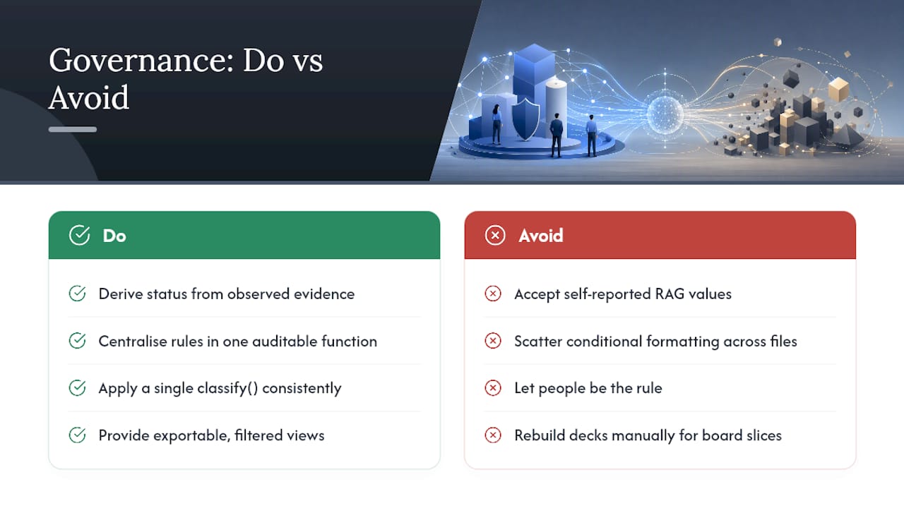
The dashboards that hold up under scrutiny share one design choice: they derive status from evidence rather than accepting whatever a project manager typed into a field last week. Observed movement, meaning actual changes in the underlying data, tells you far more than a self-reported red, amber, or green ever will.
Centralising that logic matters just as much. When the rules for what counts as "at risk" live in one auditable function rather than scattered conditional formatting across a dozen spreadsheets, a compliance reviewer can actually trace how a status was reached.
A single classify() function, applied consistently, turns "trust me, it's fine" into a rule someone can read, question, and defend in an audit. That's the difference between a status update and a governance artefact.
Exportable, filtered views close the loop, letting a programme lead pull exactly the slice a board needs without rebuilding the deck from scratch. Keystoneconsulting's work inside regulated sectors, including the Videra Healthcare platform, applies this same principle: govern the rule, not the person reporting the number.
Build a working dashboard in a day: templates and a starter checklist
You don't need a procurement cycle to get a working dashboard live by end of day. Start with a minimal dataset covering just eight fields: id, title, team, owner, start_date, due_date, percent_complete, last_update. That's enough for schedule variance and stall detection to work immediately.
For the zero-dependency route, paste your data as JSON or CSV directly into the single-file dashboard template and set a snapshot date so the stall threshold calculates against "today" rather than a stale reference point.
For the self-hosted route, a basic docker run command with environment variables for your database connection gets ProjectStatusApp live in under an hour, though you should restrict access behind your existing authentication layer before adding real project data.
- Confirm your eight core fields are populated for every active project.
- Set the stall threshold to match your review cadence, not an arbitrary default.
- Export a filtered, print-ready view before every steering meeting rather than screen-sharing the live tool.
When to keep it simple and when to invest further
A template is enough when you need an honest answer fast, particularly in a locked-down environment where new software approval takes weeks you don't have. Reach for a governed platform once you notice the same pattern repeating: manual consolidation before every steering meeting, statuses that never seem to change even when the underlying work clearly has, or an auditor asking how a number was reached and nobody having a clean answer.
The sensible middle step is a small proof of value. Run the derived-status logic against one programme for a month, compare it against what project managers were self-reporting, and let the gap between the two make the argument for governance investment on its own.
— Peter
How Keystoneconsulting brings governance to your program dashboard
The templates above solve the urgent problem. They don't solve the recurring one: reporting drift creeping back in once the spreadsheet gets handed to someone new, or an auditor asking how a status was actually derived six months ago. That's the gap Keystoneconsulting's Videra platform closes, with mapped workflows and AI-powered reporting that keep status logic centralised and auditable rather than scattered across whoever built last quarter's file.
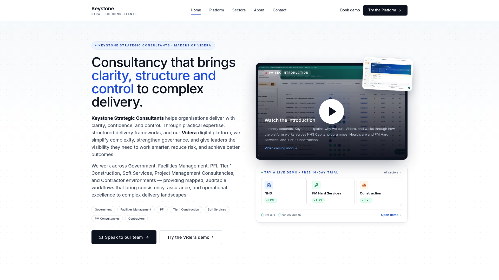
Operational leaders in healthcare, construction, and facilities management use Videra where a one-file template has outgrown its usefulness and manual consolidation before every board meeting has become the actual bottleneck. It builds on the same evidence-derived approach covered here, applied across sector-specific workspaces with stage-gated governance built in. If you're weighing whether your programme has reached that point, the Videra PM platform overview is the place to see how the configuration works before you commit to anything.
Sources
A dashboard is only as honest as its inputs, and most stale dashboards trace back to one bad habit: someone typing a status by hand once a week.
Connect the dashboard directly to the systems where work actually happens.
The failure mode to avoid is duplicate status sources: one number from the project manager's slide, another from the ticketing system, and nobody agreeing which is authoritative. Pick one field per metric and enforce it. Automation should run on scheduled pulls or webhooks that update a derived status function, not a spreadsheet someone remembers to refresh before Monday's meeting. Beware excessive configurability too. A dashboard with forty optional fields invites forty ways to hide a problem behind a technicality, and it's a pattern our guide on project management bottlenecks covers in more depth.